Leadership could describe the funnel. Nobody could actually see it.
WHY Institute had a full marketing-to-revenue funnel in operation — JV partner traffic, a multi-step free assessment, an upsell sequence, and a 16-touchpoint email system handling everyone who didn't convert. But there was no single view of it. Leadership, investors, and the marketing team each held a different mental model of how the funnel worked. Decisions were made based on descriptions, not visibility. When optimization conversations started, everyone was working from a different map.
A single HTML file that maps the entire funnel — live, clickable, and readable in one glance.
The deliverable is a single HTML file deployed on a GHL page. It maps all 11 steps of the funnel visually, from JV partner traffic through the purchase event, and below that, the full post-purchase email system.
-
01
Funnel MappingDocumented and mapped all 11 conversion steps: JV partner entry, Ryan Kohler's landing page, WHY registration flow, discovery assessment, result reveal, upsell, and checkout. Each card shows a real screenshot of the actual live page and links directly to the live URL.
-
02
Email System VisualizationBelow the funnel, mapped the entire post-result email system for non-purchasers: all 9 personalized WHY-type emails (one per archetype), the 7-email shared nurture sequence with send timing, and the 2-email reminder sequence for assessment non-completers. Every email card shows the actual email preview image with delivered, open, and click stats.
-
03
Brand-Consistent DesignBuilt to WHY Institute brand guidelines: deep navy background, crimson red for conversion and urgency steps, yellow for JV partner and reminder sequences, blue for feedback emails. Phase labels above each row communicate funnel stage at a glance. Color-coded arrows guide the eye to the purchase path.
-
04
Iterative DesignWent through multiple design rounds — from a rough whiteboard concept through dark navy mode, brand color alignment, card size increases, JV partner step additions, and logo integration — ending at a polished, production-ready file.
The goal wasn't just visibility — it was alignment. When everyone on the team sees the same funnel, optimization conversations change.
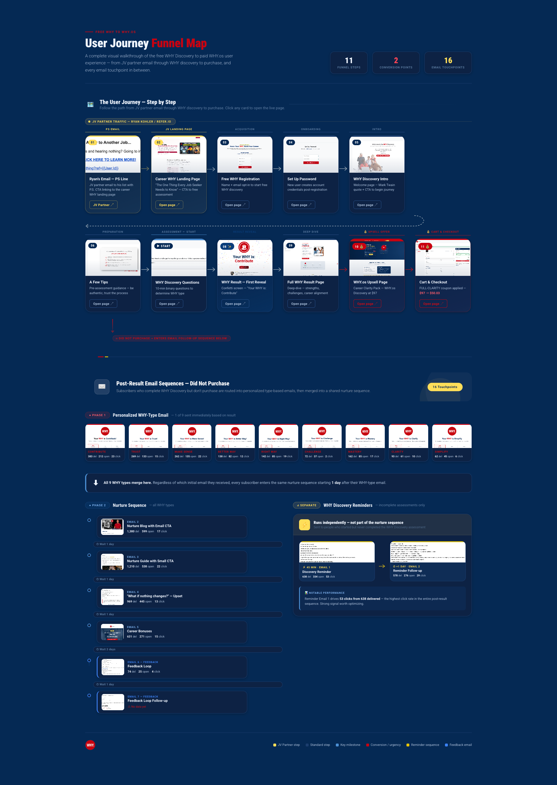
Live funnel board — 11 conversion steps, 16 email touchpoints, and 2 purchase paths in a single view
Leadership, investors, and the marketing team now work from the same map.
- All 11 funnel steps mapped with real page screenshots and live URL links
- 16 email touchpoints visualized with actual email previews and send, open, and click stats
- 2 purchase conversion paths tracked and highlighted with color-coded arrows
- Single-page dashboard deployed to GHL — accessible to leadership and investors without a login
- Eliminated the need for anyone to describe the funnel from memory; the visual replaced the conversation
- Optimization decisions now anchored in a shared, accurate view of the user journey
Every element is clickable and live. Leadership can see exactly where users are in the funnel without reading a single paragraph.